Using an out-of-focus background will help your subject stand out while also saving you time compared with drawing a detailed background
There are many ways of creating this effect, but I’ll share several that I have tried, along with when to use them.
Depending on the supplies you have, you may choose to use one method over another
Make sure to practice first on a separate paper until you are familiar with the technique before using it on the paper you have your drawing on.
Method 1: Pencil Shavings and Solvent
This first method is my favorite, and I use it for most of my drawings
You will need an odorless mineral spirits solvent (or replaceable other solvent). This method works best with oil-based colored pencils, but it can be done with wax-based pencils as well.
Use this if you are ok with sacrificing some control for a quick, yet realistic out-of-focus background.
Tip: This method also works with watercolor pencils and water instead of solvent
The procedure:
When I sharpen my colored pencils, I store the shavings to use for this. I recommend that you do the same, as it gives shavings a great new use, but if you do not yet have a store of shavings, you can simply sharpen the colors that you want over the paper.
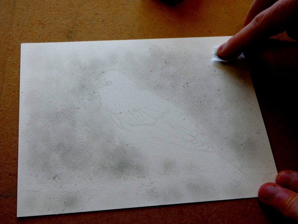
After selecting a color, pour a little bit of the shavings of it onto the paper in the areas where you want it, and gently rub the pigment into the paper with a small piece of paper towel, tissue, or a Q-tip.
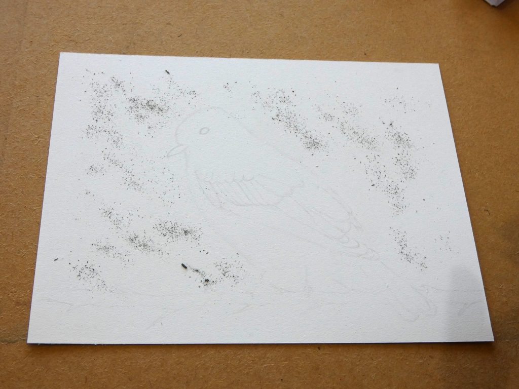
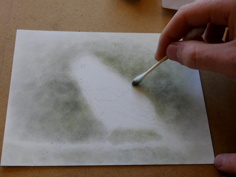
Note: I mainly use a small piece of paper towel to do the rubbing in, but a Q-tip can be helpful for brushing the color right up to the outline of the pencil drawing.
You can use a circular motion to create the classic bokeh look, though I try to avoid distinct circles to form a more natural appearance.
Some of the shavings will not fully rub it. That’s O.K. When you think most is rubbed in, just dump the remaining bits into a trash can, gently brushing them off to avoid damaging the paper.
Add another layer if you want the color to be more saturated.
Choosing colors:
This is the order in which I layer colors for a realistic, natural, and complementary background:
- White first: typically, with colored pencils, it is a good idea to layer from lightest to darkest, and the background works similarly. If you want a dark background, you can skip the white, but I generally use a fairly light background to keep from distracting from the subject. This initial white enables patches of light like that which comes through the leaves in a tree. It also creates a creamier color with any of the other colors that you layer on top of it. I usually cover most of the background in a thin layer of white before adding other colors.
- Light greys next: Before adding greens, blues, browns, or any other color, I add greys to set the values (similar to the process of an indirect painting) starting with light greys (1-3 in Faber Castell naming, 10-40% from Prismacolor) and then moving into darker greys. In skies and areas of leaves, I use cool greys, while using warm greys for things like branches, ground, or brownish leaves.
- Dark greys: I step up to darker greys (up to Payne’s grey), using them sparingly. The amount that you use of these should be based on the overall darkness of the background that you want.
- Blues: It can be easy to ruin a background with overly vibrant blues, so I suggest you stick with light-valued blues (Sky blue, Light Ultramarine, Light Phthalo Blue) and use them cautiously. You can usually layer green for leaves over the top of a light blue, so feel free to add blue to even the areas that may become leaves.
- Green: The greens that you choose to use depend on the kind of scene you are aiming to create. I typically use Green Gray, Chrome Oxide Green, Chromium Green Opaque, and other natural greens. I tend to stay away from the very bright and vibrant greens that look unnatural in a background.
- Browns: Since I usually just use browns for dirt or for branches, I change the strokes I use with brown to match the object. For trucks or branches, I either use strokes that curve around them or flow along them to give a natural appearance.
- Other colors: The colors I’ve listed are the only ones that I typically use for a realistic background, but feel free to add other colors depending on the scene or style you are going for.
Applying Solvent:
The background will likely look nice as it is at this point, but I use solvent to:
- Blend colors together
- Transform the dusty shavings into a “paint” that will stick to the paper
Before adding solvent, use a kneaded eraser to remove any background color that accidently got onto your subject (unless you purposefully want that color there).
To apply the solvent:
- Dip a Q-tip into your solvent and then proceed to gently move it across the surface of the paper. If you press hard, you will pick up the color, leaving white marks (which might be good if you want them). I use circular strokes, but I press so lightly that my strokes do not show up anyway.
- Re-fill the Q-tip when it is dry and repeat until the entire background has been covered.

(Optional) Add another layer:
Usually, the background is finished at this point, but if you want it to be darker, richer in color, or have additional color complexity, you may add another layer of shavings and another layer of solvent.
- You do not have to wait for the first application of solvent to dry before adding more shavings; in fact, you may find that the shavings will blend and rub in quite nicely while the paper is still wet.
- For the second layer, just use the colors that you want stronger. Use dark greys for making the background darker, and blues or greens to add depth and richness to those colors in the background.
- Then, once you have finished layering shavings, add another coat of solvent.
Finishing up:
I usually leave it to dry before beginning the detailed bird drawing.
Once dry, you have a background that enhances your subject and is ready for your drawing to continue.
Method 2: Watercolor (Mixed Media Artwork)
Using watercolor might be the fastest way to create a realistic out-of-focus background. If you are willing to mix media, you should give this technique a try.
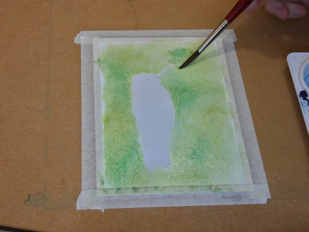
You will need watercolor supplies: hot press watercolor paper (cold press works, but is not as nice for colored pencils), watercolor paint, brushes, water, a drawing board/clip board, and tape.
Preparing the paper:
As is standard with watercolor, first soak the paper and tape it to your board.
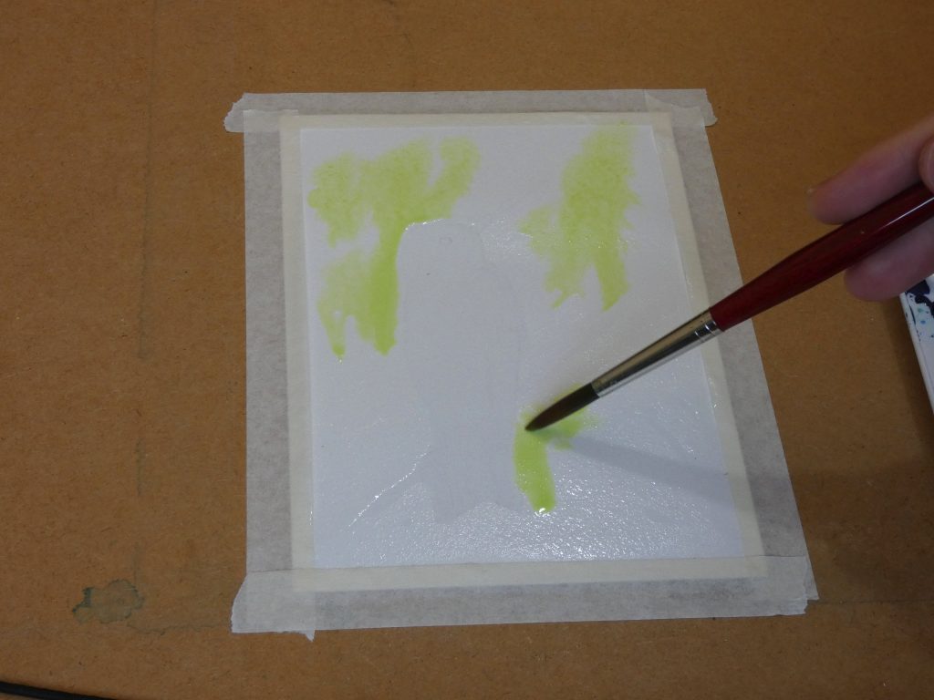
After it dries, coat the entire background in water. Use enough water for it to be wet, but not so much that puddles form (if they form, you can always remove them with a paper towel). This “water glaze” makes it easy to keep the paint from spreading into the subject, and keeps the paper wet long enough to add and blend various colors.
If possible, use an easel or some alternative way of angling the paper. Then, gravity will help you cover the background with paint.
Procedure:
- First mix the colors you will use.
- Add them in various places throughout the background, letting them mix and drip.
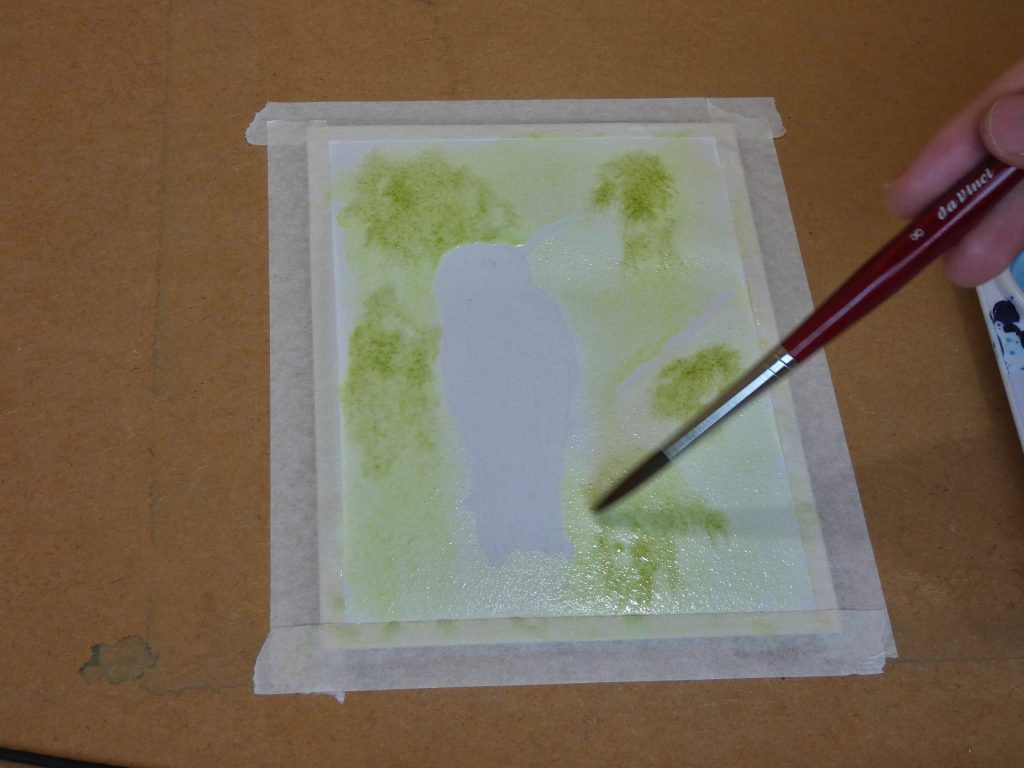
- Blend colors with a damp, but not too wet, brush, for maximum control.
Choosing colors:
First use lighter colors (such as yellow green), and then proceed to darker colors (such as dark green).
Use natural colors.
Find out how the colors will mix before adding them to the piece (otherwise you could end up with “mud”).
Finishing up:
Once the background is dry, I advise that you apply a layer or two of watercolor on the subject to add an underpainting for the later colored pencil work. This unifies the drawing/painting by removing the little white specks that are left from a purely colored pencil approach.
You can begin with colored pencil as soon as the watercolor is dry.
Method 3: Pastels (Mixed Media Artwork)
This is another mixed media method that enables a very quick, yet effective out-of-focus background.
Supplies:
- Paper for pastels (such as Canson Mi-Teintes),
- Pastels (pan pastels are best, then soft pastels, and hard pastels can be used but are not recommended),
- Paper towel (for blending pastels, and for resting your hand on to keep from smudging the artwork).
Procedure:
Choose a set of 3-4 colors and use them in patches throughout the background.
Blend colors together, adding smooth transitions, for an out-of-focus effect.
Finishing up:
Cover your subject with pastel before continuing to using colored pencils for the details. This will save your colored pencils as the rough pastel paper will otherwise wear them quickly, and you will need to sharpen the pencils often.
Finish the piece with fixative, put it behind glass, or use some other method of protection, as pastel works are fragile.
Method 4: Light Coloring and Burnishing
This is the only method that just uses colored pencils.
Use this if you do not want to use solvent or mixed media.
Procedure:
- Lightly color with the side of the colored pencil.
- First use white to allow future layers to lay down smoothly.
- Let nearby colors overlap slightly, for a gradual transition.
- You may layer colors (as in method 1), for best results.
- Use a colorless blender or the white colored pencil to burnish if you want a soft-focus effect.
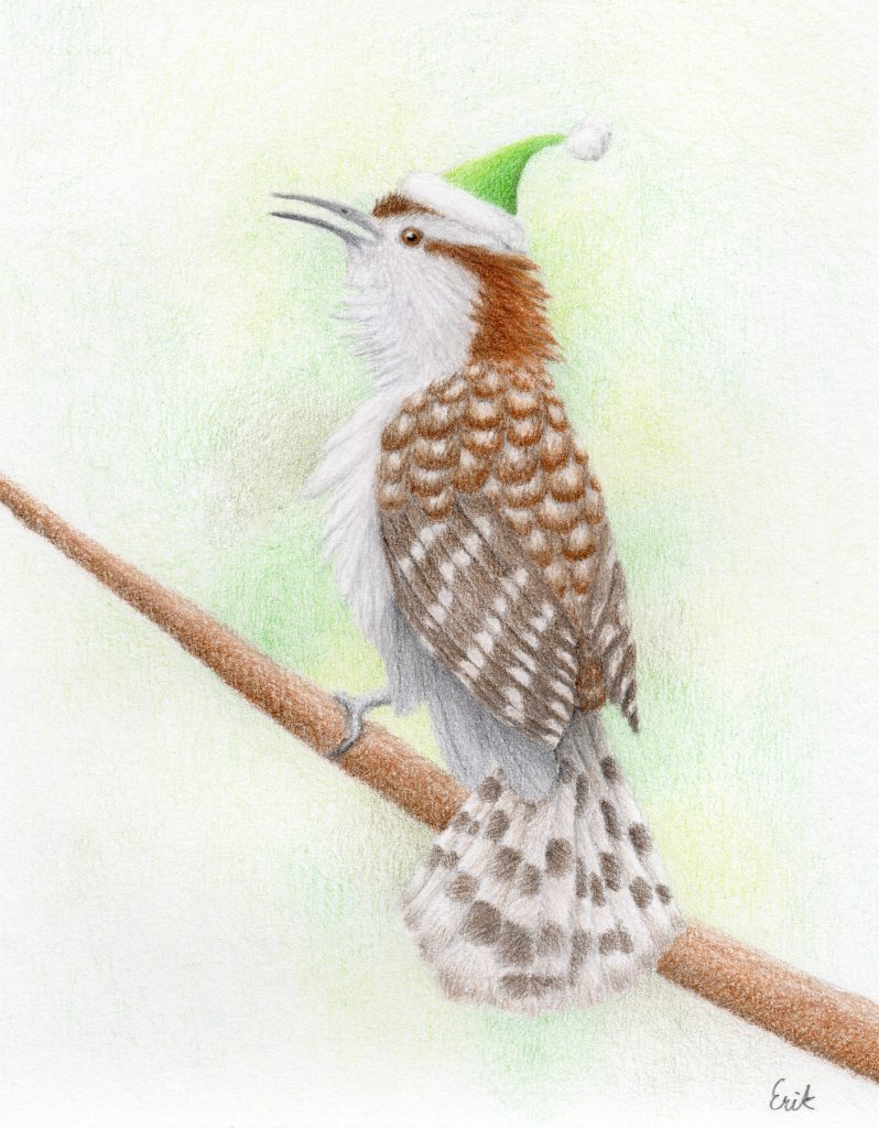
I have used this method in the past (for example, in the drawing below), but have found method 1 to be much faster and easier to create a pleasing result.
Therefore, I recommend this method only if you do not want to use solvent or mixed media.
I hope you found a useful technique for creating out-of-focus backgrounds in this tutorial. Let me know in the comments which method worked best for you.

Hello just wanted to give you a brief heads up and let you know a few of the images aren’t loading correctly. I’m not sure why but I think its a linking issue. I’ve tried it in two different web browsers and both show the same outcome.