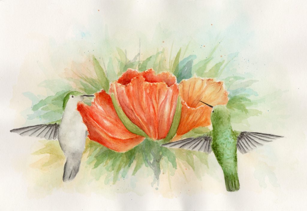
The following is a tutorial for creating a watercolor painting of two hummingbirds and an orange flower cluster, combining several reference photos and implementing color theory for a vibrant result. The process takes some time (about 4-5 hours), if you patiently work the layers, I think you will appreciate the result. If you are new to watercolor painting, or would rather a less advanced lesson, you could try one of these first (oriole, grosbeak). Otherwise, let’s begin.
Supplies Needed
- Hot press watercolor paper (I used half of a 10 by 14-inch Arches paper)
- Transparent watercolor paints (colors detailed below)
- At least a large brush for the background and a medium/small brush for the details and flowers
- Something to draw with (such as an HB graphite pencil and a kneaded eraser)
- Tape and a clip-board/drawing-board
Composition and Drawing
The first step, after deciding on a subject, is to determine the composition of the artwork. I wanted to paint two hummingbirds (the subjects), so I found several reference photo ideas (pictured below).
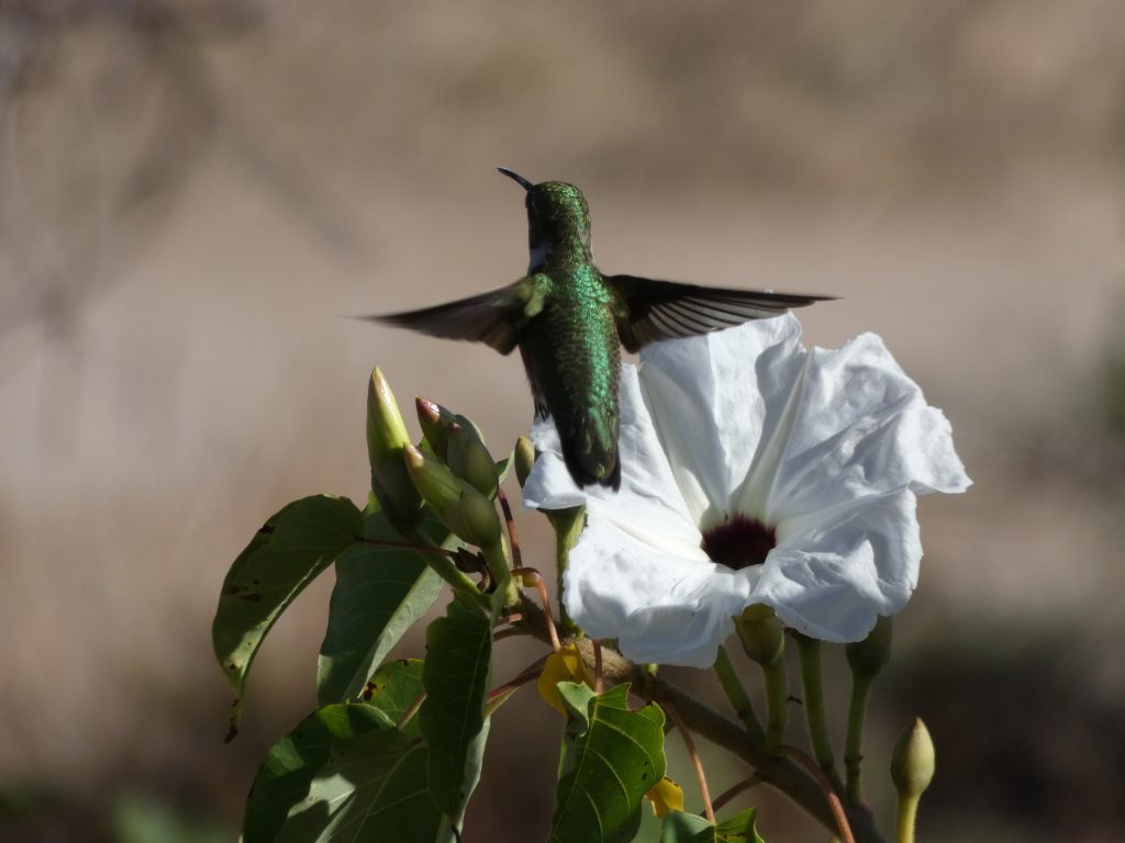

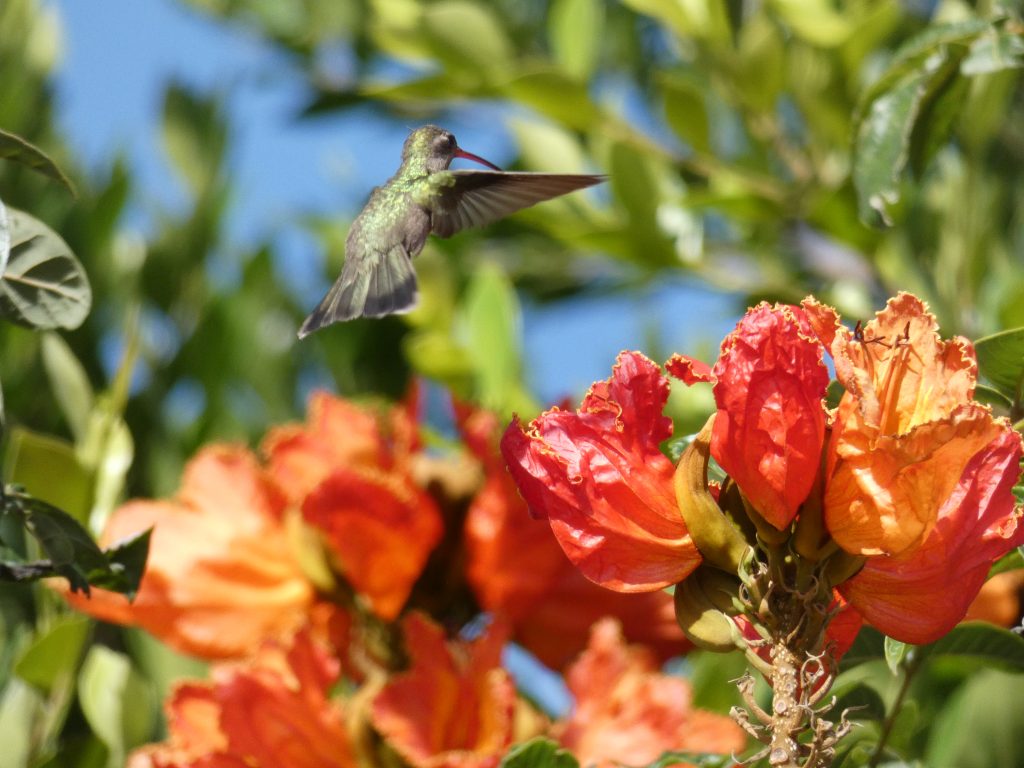
(P.S. If you want to take pictures of hummingbirds, check out these tips).
When planning composition, it is best to try ideas on a separate paper, to avoid having to erase on the watercolor paper (drawing and erasing on hot press paper can leave ridges and ruin it). Using the flower cluster from one image, and the hummingbirds from the others, I drew this sketch, which seems like a nice composition for the painting. You can use it too, if you would like, or experiment with other positions or flowers or hummingbirds from other photos.
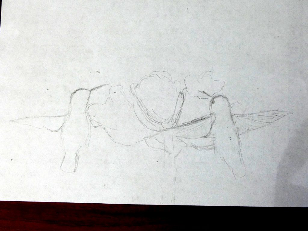
Once you have sketched your plan, you can draw it lightly on the watercolor paper. I suggest only drawing the flower and hummingbird outlines, so that you can be freer while painting.
Color Palette
With watercolor, it is important to choose a small set of colors that you will use beforehand, and to consider color harmony and the way in which you will incorporate it into your painting.
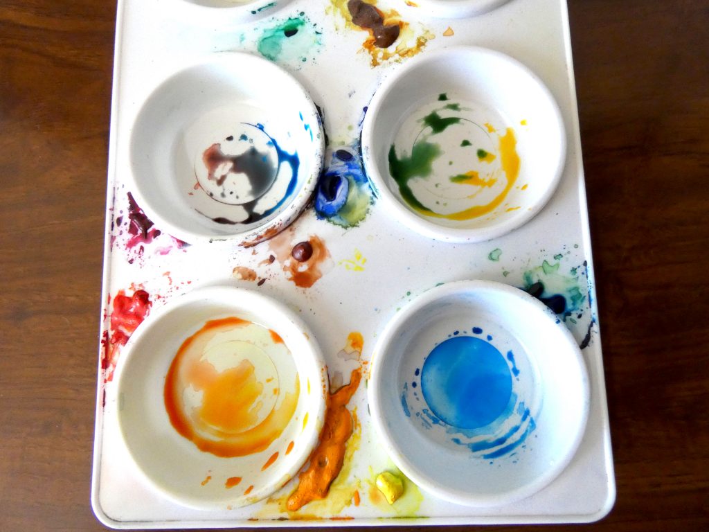
Since I wanted to use realistic coloring, I knew I’d need colors that could make bright oranges and dark, emerald greens. To get the brightest orange, you need warm yellow and warm red (the split primary palette), so I chose New Gamboge and Pyrrol Scarlet. The most brilliant green comes from cool yellow and cool blue, but I did not want to use both types of yellow, and found that a sufficiently bright green could be mixed from New Gamboge (warm yellow) with Phthalo Blue Green-Shade (cool blue). That same blue makes a nice sky color, so I think these three paints should be enough for the painting.
If you are using a different brand or selection, that is perfectly fine, you will just need to choose a few paints that can be combined for the different colors you want to include, keeping in mind that the less different pigments the better. By sticking to three paints, we ensure that different combinations will not clash, but will complement each other.
Here is a picture of some of combinations that can be mixed from the colors I chose, which will be useful for the background.
Initial layer
The first background layer will be a light wash of some of the color mixtures shown above. This layer, which is nearly invisible, is helpful as it unifies the contrasting colors in the painting. To do this, first cover the paper with water, then, with some paint in a paintbrush, add color in areas and spread the paint out. I stuck with mainly yellow for this layer, but used some green and blue on the upper half. This is because yellow is the color that will be in most of my other mixtures, but I wanted to leave a little bit of the sky without it, to be blue rather than green. Paint this layer even over the flowers and hummingbirds (this way, areas left unpainted later on will be more natural looking than if they were left with the white of the paper).
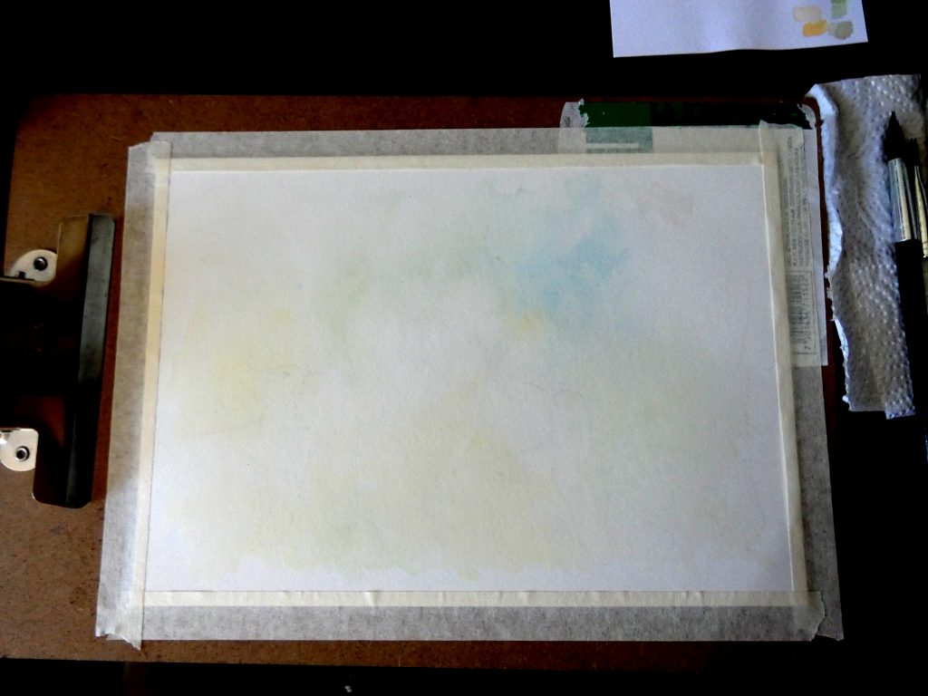
Background
Colors
Next, we focus on the background, and we will begin with background colors before adding background objects. To add distinction to the subjects (contrasting them with the background), we can add paint along the outline edges, and use a damp brush to spread it outward, such that it forms a sharp edge along the outline, but a soft gradient away from it (as shown in the close-up picture below).
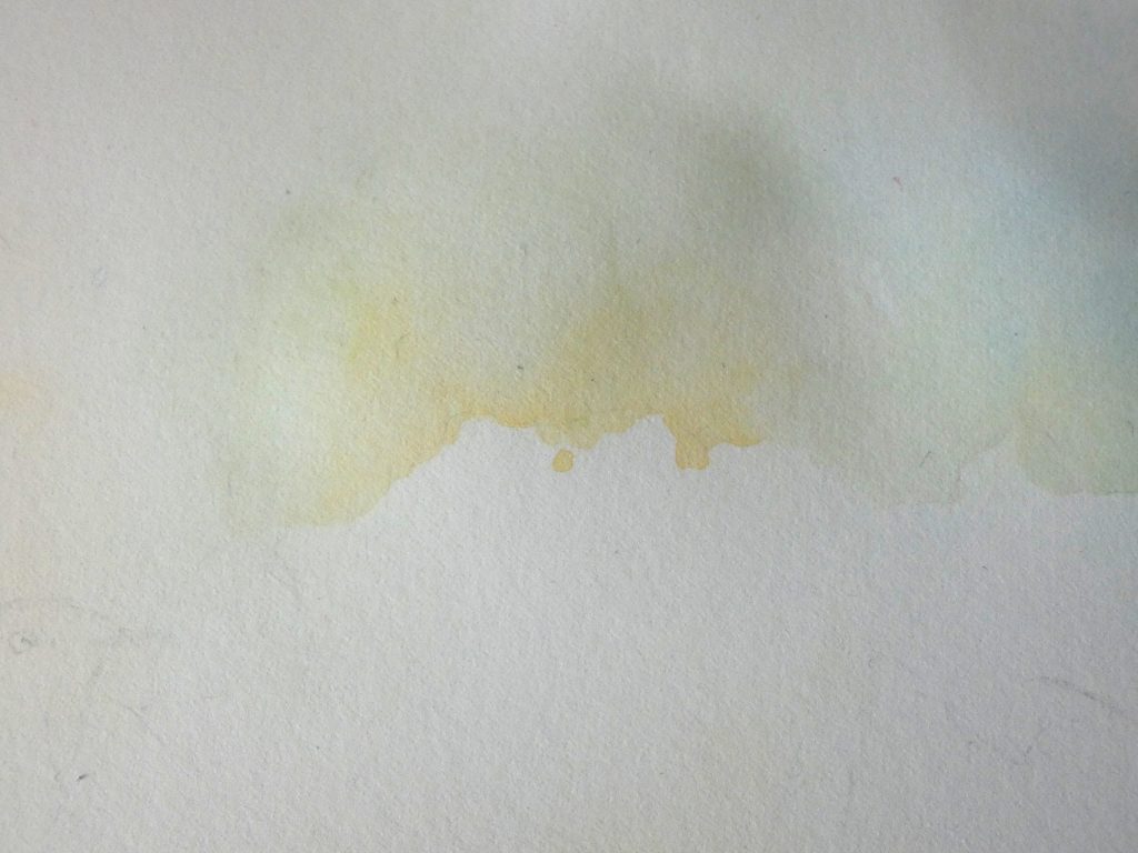
I stuck to doing this with the same colors in each area as had been there from the initial layer, but you are free to choose these colors as you like.
Add one to three of these layers, keeping the background light, but still with enough color to contrast the subjects.

Objects
Now, we will add objects (leaves, stems, other flowers, etc) to the background. By starting with mostly transparent paint and progressively adding more layers of darker paint, we can give the background a foggy, fading-away effect. You can see this principle in the picture below, in which I painted three blue leaves, each with a different paint/water ratio.
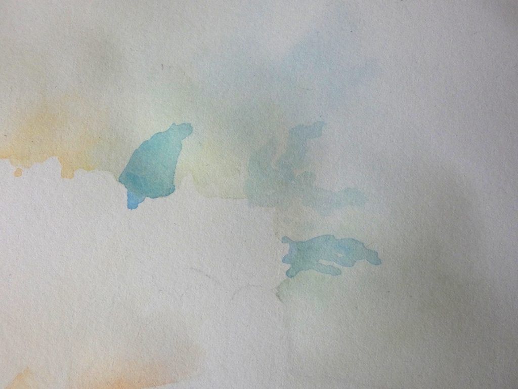
While sticking to colors formed by combinations from the three paints, add background shapes around the flowers. This further defines the subjects from the background. Now is the time to add some splatters, if you enjoy that effect.
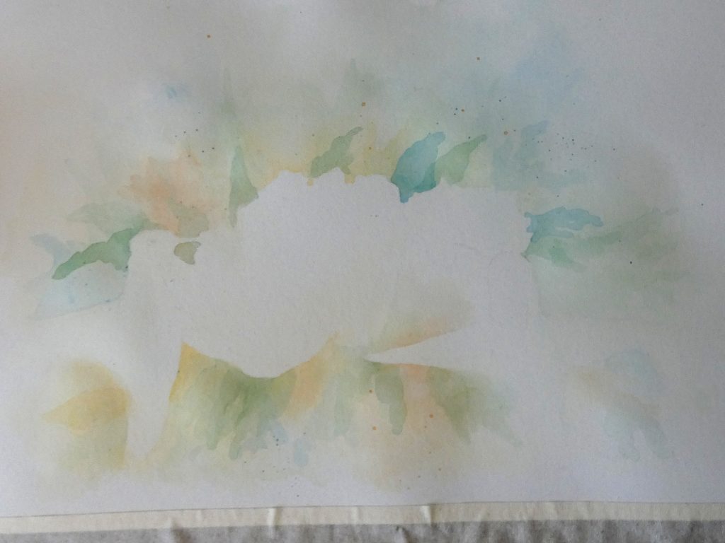
We can keep adding layers, darker and closer to the subjects each time, to complete this background effect. You may want to add especially dark layers below the flowers, to form a shadow impression. (At this point, I also added a light green layer to the buds that are between flowers).
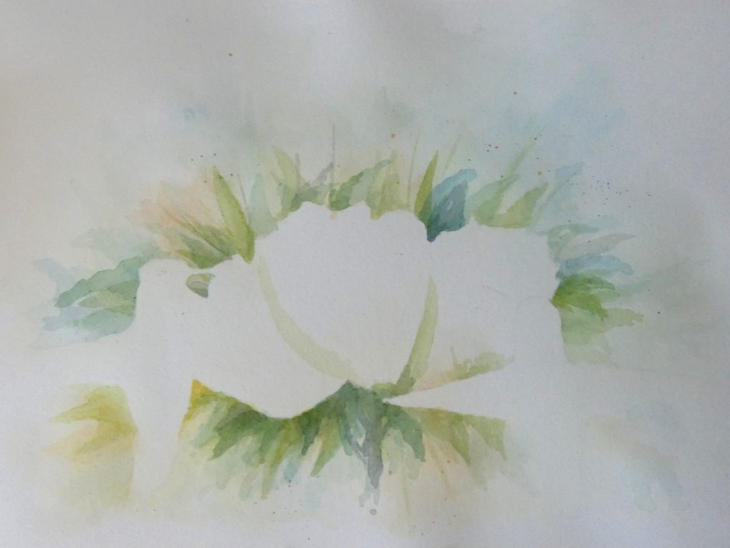
Flowers
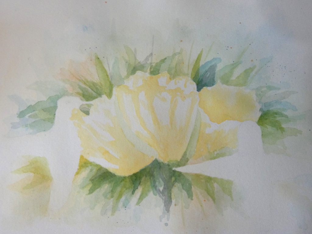
We will paint the flowers in a few separate layers. First, with warm yellow, paint near the base, along the petal edges, and down the petal veins. Leave some paper unpainted, to give the flower a shiny look. While most of this layer will be covered up, it will combine with the next layers and deepen the color. Remember while painting the flower to use brush strokes that flow along the shape of the flower, in the same direction as the veins.
Then, after the yellow has dried, paint a little water on the flowers (this makes it easier to form gradients) and we will start adding orange. With a technique much like the edge-softening one, we can paint along a vein edge, and soften the paint outward on one side to form the ridge.
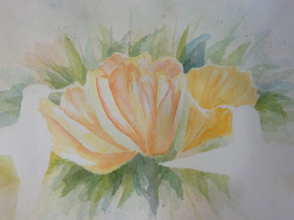
Continuing the same process with a darker orange (more red paint added to the previous mixture), we can keep adding layers and deepening the color. Use the darkest red in the darkest shadows, softening it in a transition to the lighter, more orange parts. Don’t forget to leave a few gleaming white areas where the petal bulges and on the frilly ridge.
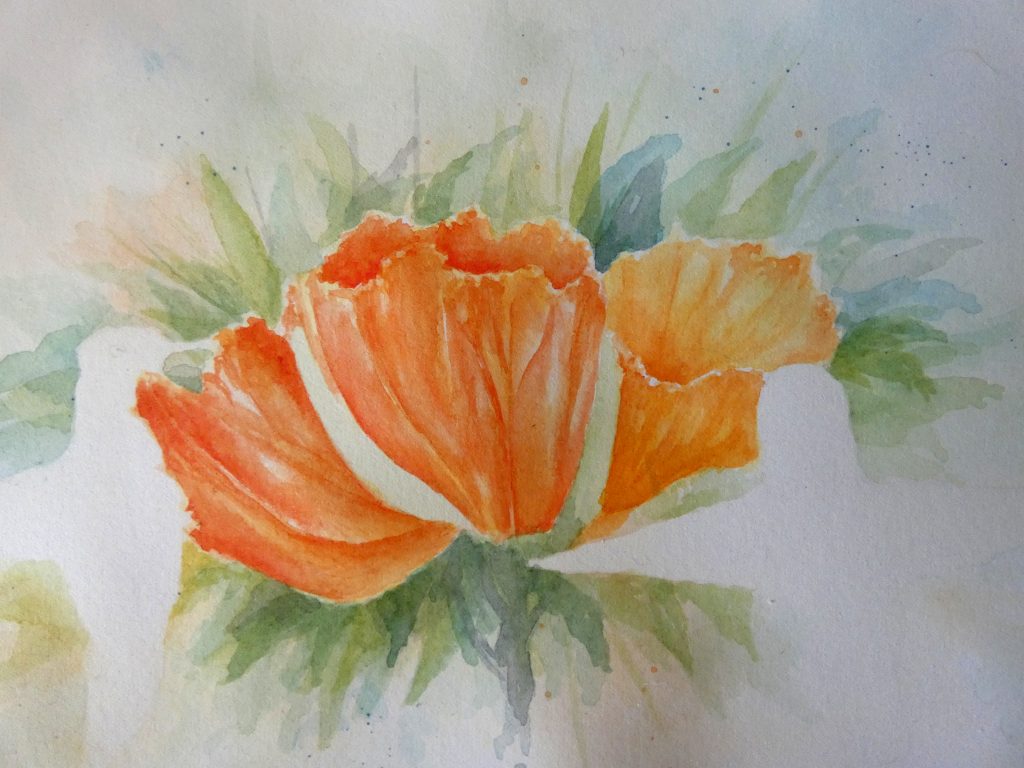
We will finish the flowers with a shadow color (brown formed by adding a drop of blue to the orange mixture). Add this (using the same edge and soften method) to the lower parts of the flower, and along the darkest shadows. This slightly reduces the vibrancy of the flowers, but helps to unify them with the other parts of the painting that also contain blue.
You can also add thin veins with red, or brown, if you want to.
With a few green layers paint the buds in a similar way, adding paint along a shadow edge and softening it to a gradient across the shape.

Hummingbirds
Before starting the hummingbirds, I want to point out a detail in this process that normally must be considered. When using multiple reference photos for one painting, it can be easy to forget to pay attention to the direction of the light source. If the different images have different lighting, and we bring that into the painting, the subjects will not go together well, and the result might not look realistic. Conveniently, in each of the reference photos we are using, the light is coming from the middle-right, from the direction of the viewer. This means we can paint shadows similar to how they appear in the photos.
It does not matter which hummingbird you work on first, but I started with the one on the right. For the green parts of the hummingbirds, we can develop the color with a series of thin layers, each one darker than the previous, and we limit the darker layers to the areas of shadow. Here, I made an exception to the rule of sticking to our three colors: I used a little Phthalo Green Blue-shade on the hummingbird to better approximate its actual color (I first tried painting this color next to the other greens on a separate paper to make sure that it would not disrupt the harmony). You can use some of that color too if you have it, but it is perfectly fine to stick with greens from the cool blue and warm yellow combination that we have been using.
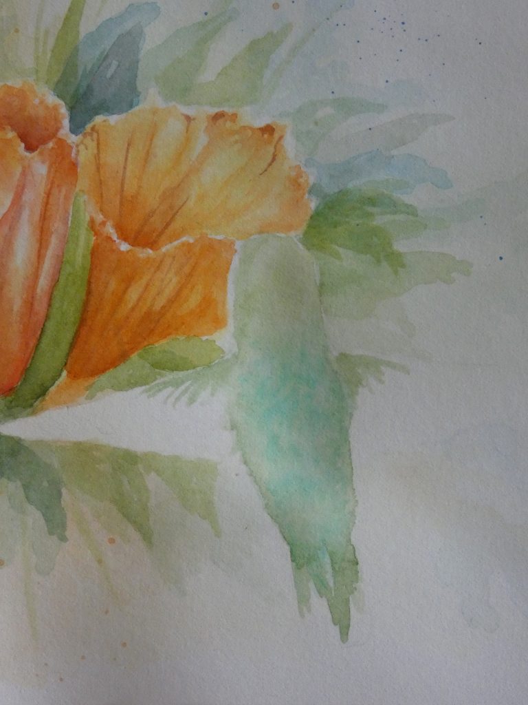
We can add a few more layers to deepen the color. We will add some feather texture later, once this paint dries; in the meantime, we can address the wings.
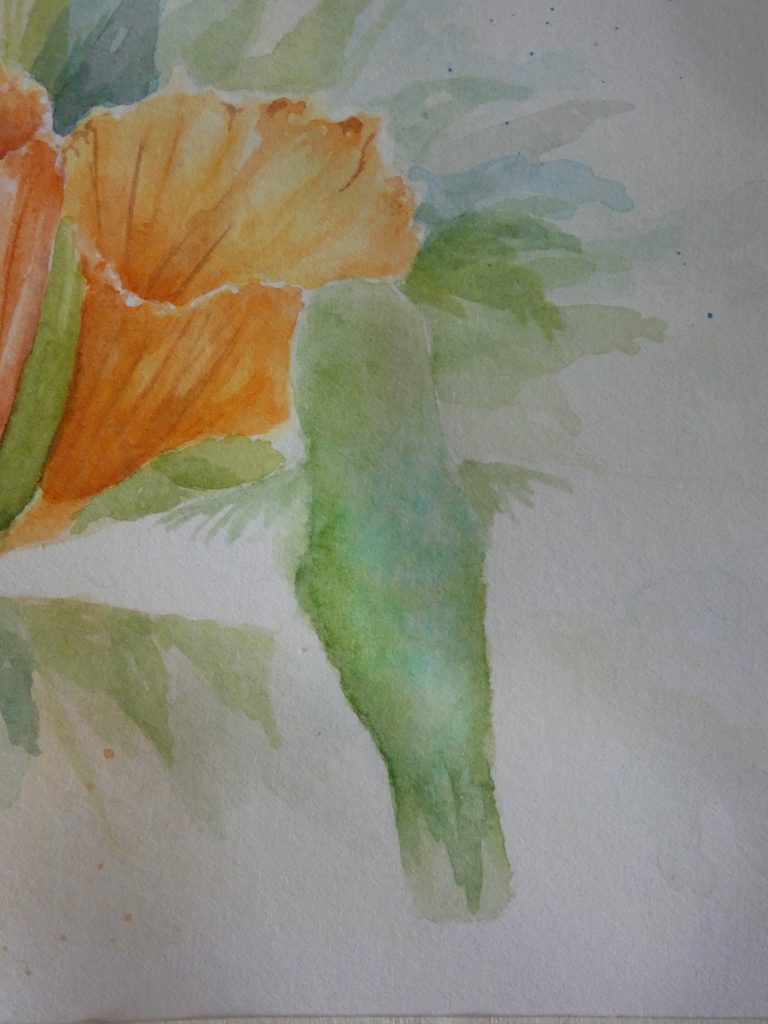
Mixing warm red with cool blue results in a nice grey for the wings. We will start with a layer of light grey, and cover all the grey feathers. Then we can use the edge and soften technique to develop feathers. First paint a line of dark grey down the border of a feather, then use a clean, damp brush (I keep a separate brush ready for this so that I do not have to keep switching back and forth) to form a gradient, pulling some of the paint away from the border and unto the rest of the feather.
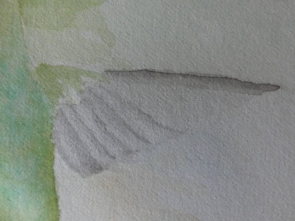
We keep repeating this process, layer after layer, until the feathers are dark enough and have enough definition. For the short, black feathers on the upper part of the wing, simply paint short strokes and add layers to darken as needed.
You can use this same procedure to paint all three visible wings.

Using a bit of dark green paint, on a mostly dry brush, we can add feather details to the green body of the hummingbird. To do this, use a very thin brush and paint short strokes in small clusters, sporadically across the body. You can also use this dark green to better define the tail feathers and darken the shadows. For the darkest green shadows, add a bit of red to the green for an even darker color.

For the other hummingbird’s body, I used various shades of grey, and added a drop of yellow to the paint mixture to make the grey warmer and somewhat distinguished from the cool grey wings. The procedure is just the same as with the green hummingbird back, but with greys; simply paint along the shadows and soften it outward. You might find it helpful to first paint the hummingbird with water, so that the shadows are more gradual and softer.
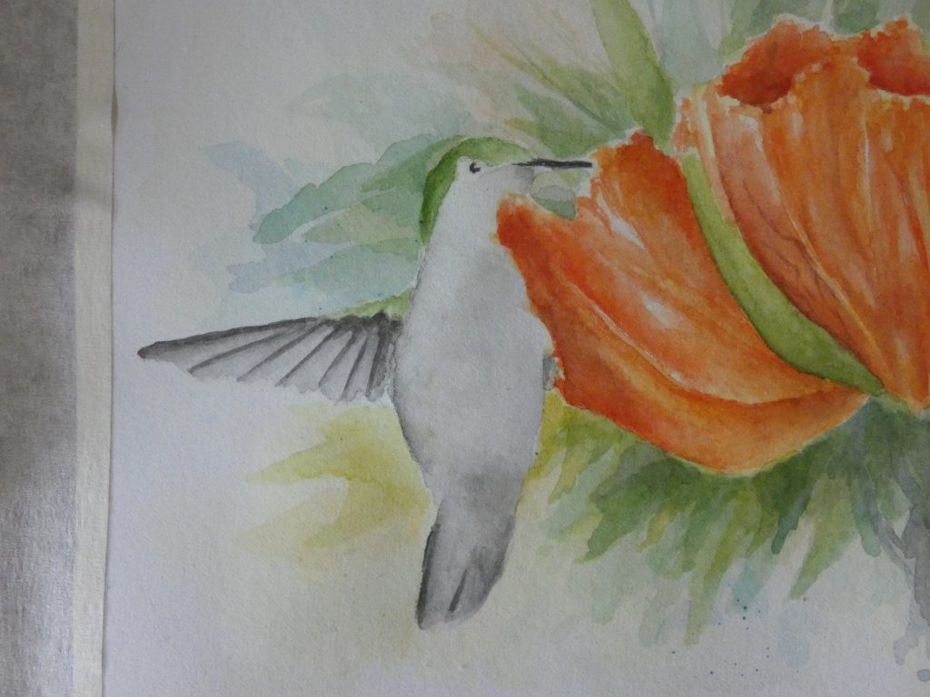
We will finish with the beaks and eyes. Using a very thin paintbrush, and dark grey, paint a line for the beak, and make it slightly wider near the head. For the eye, paint a sort of “C” shape, leaving a small white circle for the catchlight. To make the eye painting process easier, if you have masking fluid, you can mask out the catchlight first, then paint a filled circle around it, and peel it off when the paint is dry.
For the hummingbird on the right, the head is in a different angle, so the eye is more oval shaped and the catchlight is smaller and on the front.
With that, the painting of two hummingbirds with orange flowers is complete.


1 comment