The final part in the Watercolor Waterbirds series is a tutorial on how to paint a Tiger Heron. This time, we’ll consider several aspects of color in the painting, as well as simply gain practice using techniques for painting the eye, beak, and feathers.
If you have not done so already, I suggest working through the first two tutorials (the duck, and the Green Heron) before beginning, as we will build on the concepts and procedures used in those tutorials for this Tiger Heron.
Here is the reference photo we will use. (Because of the lack of light when I took the picture, the bird’s colors appear duller than they should, and we will increase the color saturation and vibrancy to compensate. The photo is also not as clear as I’d like, but we don’t have to make the painting highly detailed, so it will be sufficient.)

After a light drawing, we can begin painting.
You may remember the general procedure we use to paint the bodies of water birds in this style: first, with a layer on wet paper to map out general values and colors (making sure to preserve highlights), then, using a layer on damp paper to add depth to the color and begin to form some of the details, and finally with one or more layers on dry paper for hard-edge details (using the edge softening technique for controlled soft edges). And the eye, beak, and feet are done by a series of layers with softening edges. Let’s begin.
Base Layer
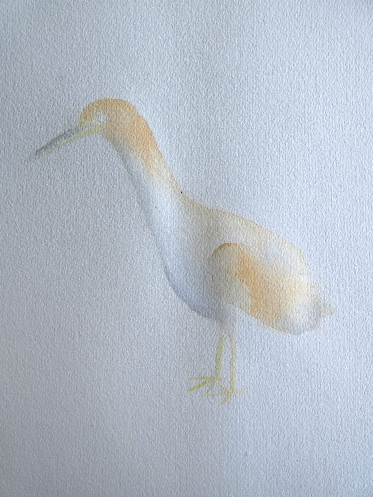
We’ll start with a water glaze over the body to wet the paper, and paint in Raw Sienna (or a similar color) in the areas that will be orangish brown, drop in a little grey (I mixed mine with French Ultramarine and Burnt Sienna) on the shadow edge, and lift some of the paint in the highlight regions. Note that by leaving the wing’s curve dry, it will stay defined, which will make it easier to remember where it is later.
Once that section dries, we add water glazes to the beak and feet, and give them each a simple layer of color. To keep the grey of the beak from mixing too much with the yellow and ruining the beak’s color, first paint the yellow (I used Azo Yellow), and then paint the grey separately, or at least when the beak is not as wet.
The Eye
As we have done before, we will focus first on the eye, then move outward in adding detail to the bird.
The procedure for the eye is very similar to what we have used in the previous two tutorials, just with different colors. In this case, I used Azo Yellow for the iris color, added Raw Sienna for shadows, and a dark grey (concentrated for a black-like appearance) as usual.
We start with a simple layer, preserving highlights.

Then we add the darker iris color around the outside, and soften it inward with a clean, damp brush.

We repeat.
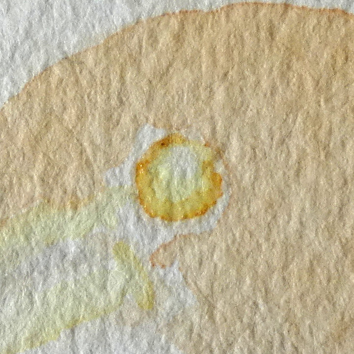
Then we paint the pupil, leaving the catchlight white, and darken the shadow around the eye.
Technique Tip: use very little paint on a mostly dry brush for the thinnest lines.

The Beak
Working first on the grey parts, then on the yellow, we can convey the shape of the beak with layers that define shadows, highlights, and the smooth transition between them. Here is what it might look like after one layer (above the base layer):
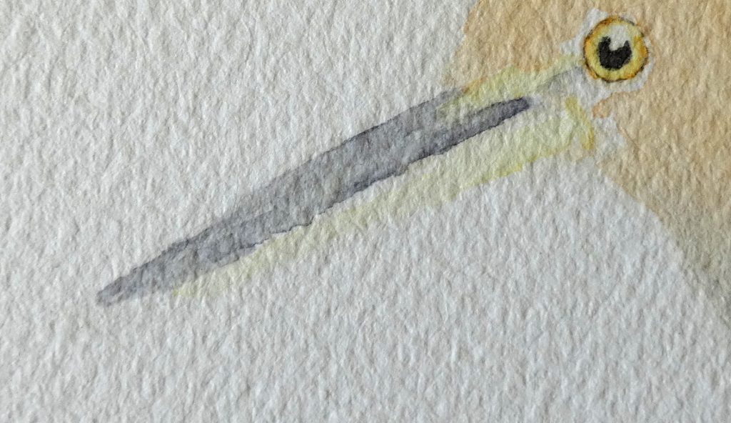
We then keep darkening the shadow with additional layers. As with the beaks in the previous two tutorials, we do this by painting along the dark edge, and creating a gradual transition away from that edge using a damp brush (with the edge-softening technique).
Color Tip: Using greys between that vary just black and white will have a flat-looking result; try adding blues, purples, or other dark colors to dark areas (such as the beak) to give it a shiny and more natural appearance.
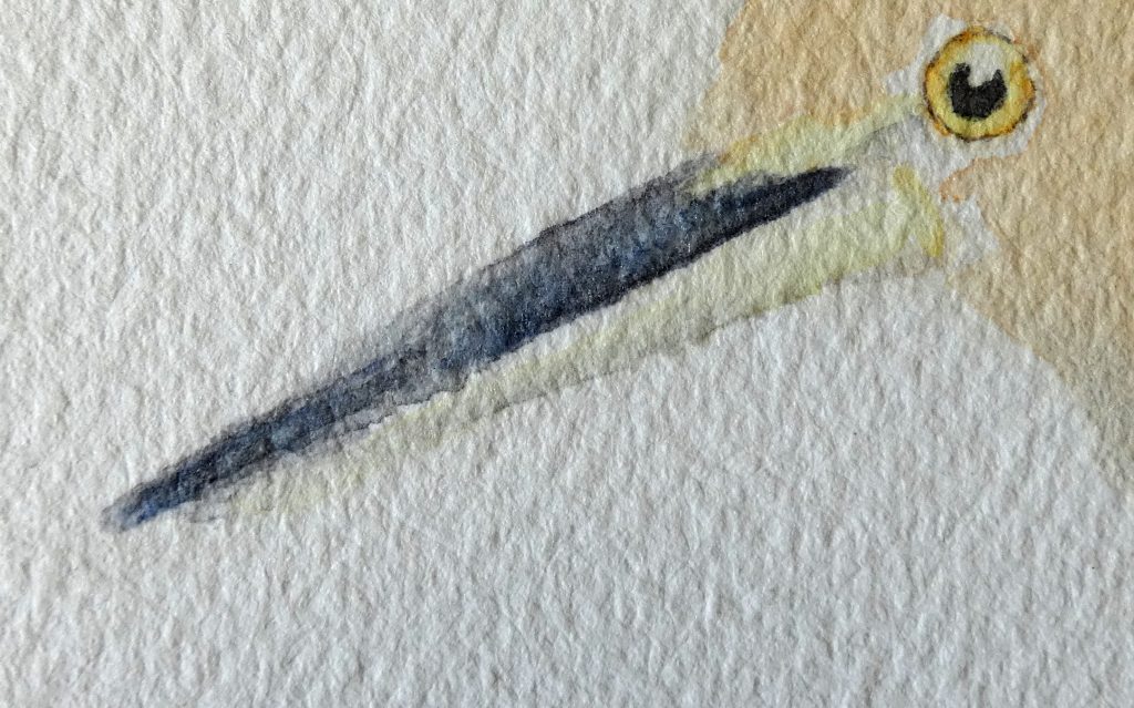
When the top half is dry, we can paint the bottom half of the beak in a similar way. Here, I used Azo Yellow and Raw Sienna, and mixed in a tiny bit of the grey (that I had already) for the shadow.

With a little more grey paint we can add finishing details to the beak.

The Body
We’ll paint the next layer for the body on damp paper, by adding a water glaze to the area we plan to paint, and letting it partially dry before painting. In this layer, we just need to increase the color vibrance while preserving highlights (gaps that let the base layer show through) that will be useful for conveying feathers. Beginning with the head …

… and continuing to the back and wing.
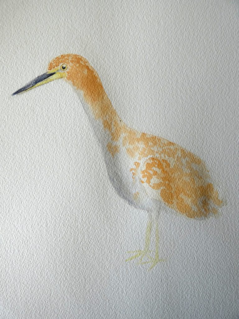
Now we have to wait for that to dry before we can start the detailed layers, so let’s work on the feet in the meanwhile.
Using similar colors and techniques as on the beak, we will give form to the feet using shadows.
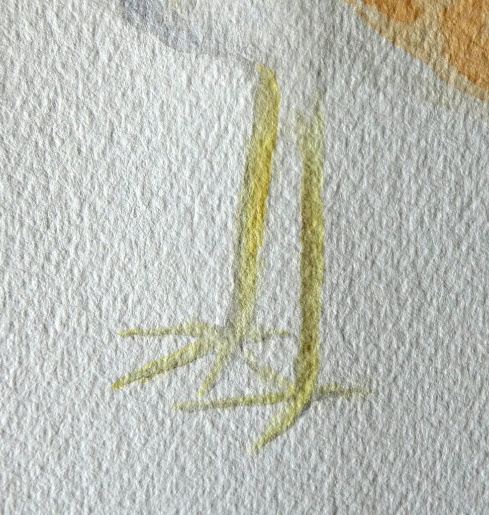
And just like with the beak, more layering results in a higher contrast and color saturation.

Back to the body; we will now paint on dry paper so that our brushstrokes leave well-defined marks. Using a dark brown (Burnt Sienna with a little bit of French Ultramarine), we can start adding the markings that give this heron its name. Don’t worry about copying each marking from the photo; instead, use the photo as a reference, and paint with a similar pattern to how you see the shapes arranged in the photo.
We can keep the wing defined by first adding marks around it …
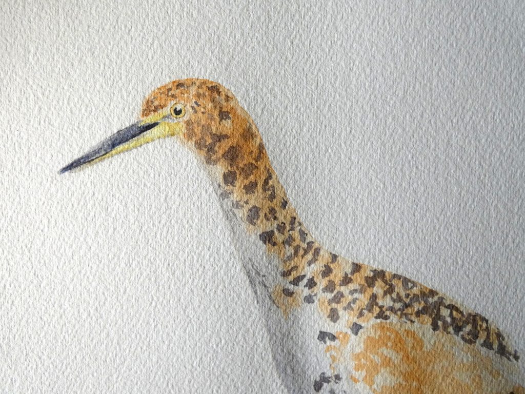
… then painting marks on it, using a different direction, length, and shape of brushstroke, since the wing feathers have a different direction, length, and shape as the feathers on the back.
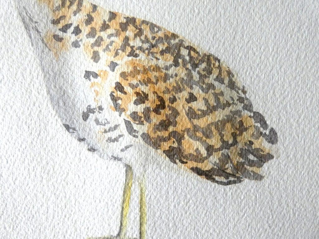
As with the feathers on the duck, we will layer on top of the markings we just made (with a darker color made with more French Ultramarine added), to darken them and create a more realistic texture.
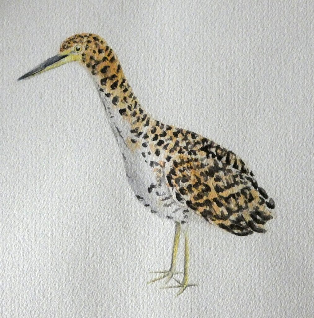
Now, we can do the same thing, using the orange brown colors instead, to increase the color vibrancy. Normally, we would do this before adding the dark markings, since we typically try to work from lightest colors to darkest, but in this case, I wanted to first map out the dark markings, to know where to keep highlights when adding more color.
You can add additional layers if you want, but I was happy to stop here.

The Background
To continue with the style of the series, we will add a water glaze around the bird and paint the background on wet paper, for a soft-focus effect.
Color Tip: to make the bird stand out from the background, use opposite (complimentary colors) in the background.
In this case, we can use blue to bring out the orange in the bird, and I also added a bit of green, but purple could work as well, to emphasize the yellow. It is also a good idea to make the background darker behind the white feathers of the bird, and lighter behind black feathers.
For my painting, I was trying to complete the background in one layer …
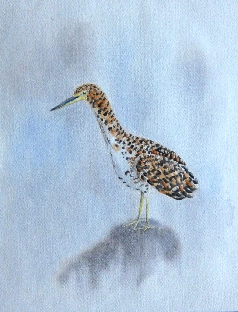
… but realized too late that I just did not use enough color, and the patches of color looked more like sloppy splashes than interesting watercolor features. So, after it dried, I re-wet the background (not to the edges this time, and painting the rock separately) and tried again, adding much more saturated paint mixtures, and I am much happier with the result. You do not have to go for the same look, but if you want to, I suggest painting the shape of the background “blob” with water, then simply painting/dropping in different colors to different areas, and spreading/mixing the paint on the paper with a clean, damp brush.
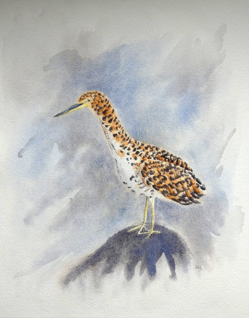
With that, our painting of a Tiger Heron with watercolor is complete, and so is the tutorial series, Watercolor Waterbirds. I hope you enjoyed it.


looks good to me, Erik:) I look forward to painting this Green Heron in the near future. Thanks!!!
ooops I mean I look forward to painting this Tiger Heron, not Green Heron!