In the second half of this tutorial on combining watercolor and colored pencil to create a painting/drawing of a Magpie-Jay, we will focus on the colored pencil aspect, finishing the bird. Check out part 1, if you have not done so already.
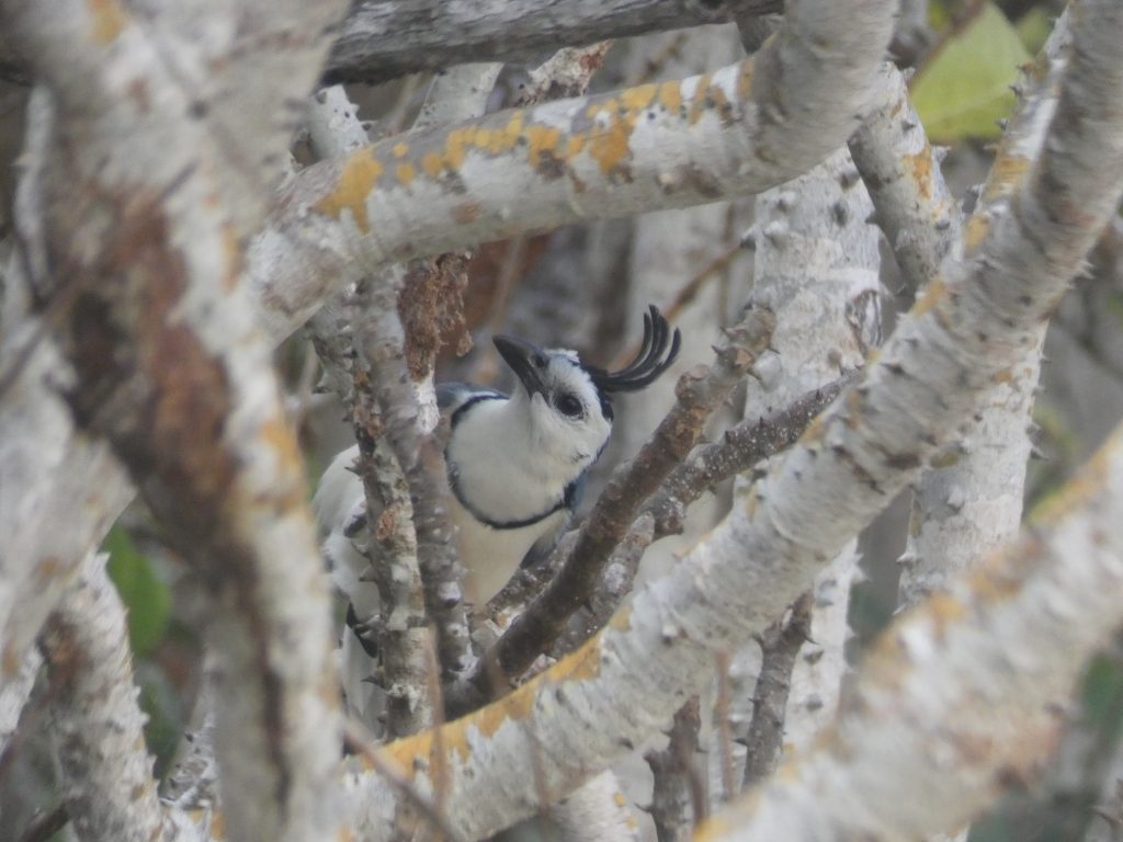
The Eye
As usual in colored pencil drawings, we will begin with the eye, a natural focal point in the artwork. Since it is difficult to layer lighter colors over darker ones, I like to first lay down white in the highlight area, and then mostly avoid that section when adding the darker colors.
If we were to just stick to white, greys, and black, the eye would appear flatter, and perhaps less realistic, so it is a good idea to use blues or purples in the eye as well. Dark indigo works perfectly for this, and I covered the dark regions of the eye with this color before using greys.
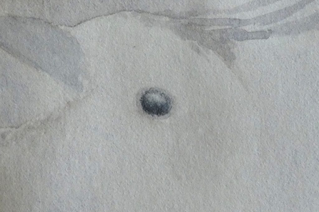
Next, working from lighter greys to darker, add layers of colored pencil to the eye, keeping its shape in mind – as it is round, the outer edge is darker, then it is lighter near the middle and in the highlight, and there is often a bit of a shadow at the top from the feathers above it. It was foggy when I took the reference photo, and the highlight is not very bright in it, but I kept the highlight brighter in my drawing to make the bird look livelier, and I suggest you do the same (you can always darken it slightly if you need to, but it might not be possible to brighten once it is dark).
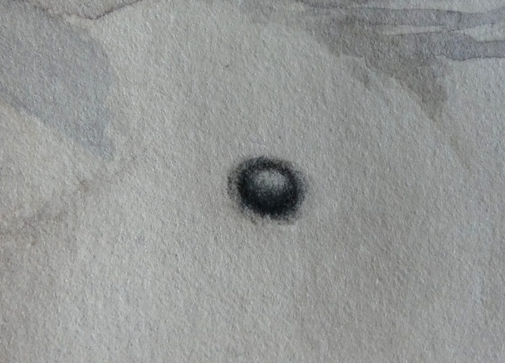
The Beak
Moving on, we will draw the beak next. We first need to make sure the outlines of the beak itself, the nostril, and the partition between beak halves are correct, since the sizes and proportions of these are important for making the bird look realistic.

Then we can proceed in a similar manner as with the eye. Begin with white to preserve the highlights, then add a touch of color (I used dark indigo, primarily on the top half, and a bit of brown on the bottom half), then use a sequence of layers of darker greys to build the shadows and give form to the beak. After adding a layer with a darker grey, if the color is speckled, you might need to burnish with a lighter colored pencil, then add another layer with the dark grey.

The Head
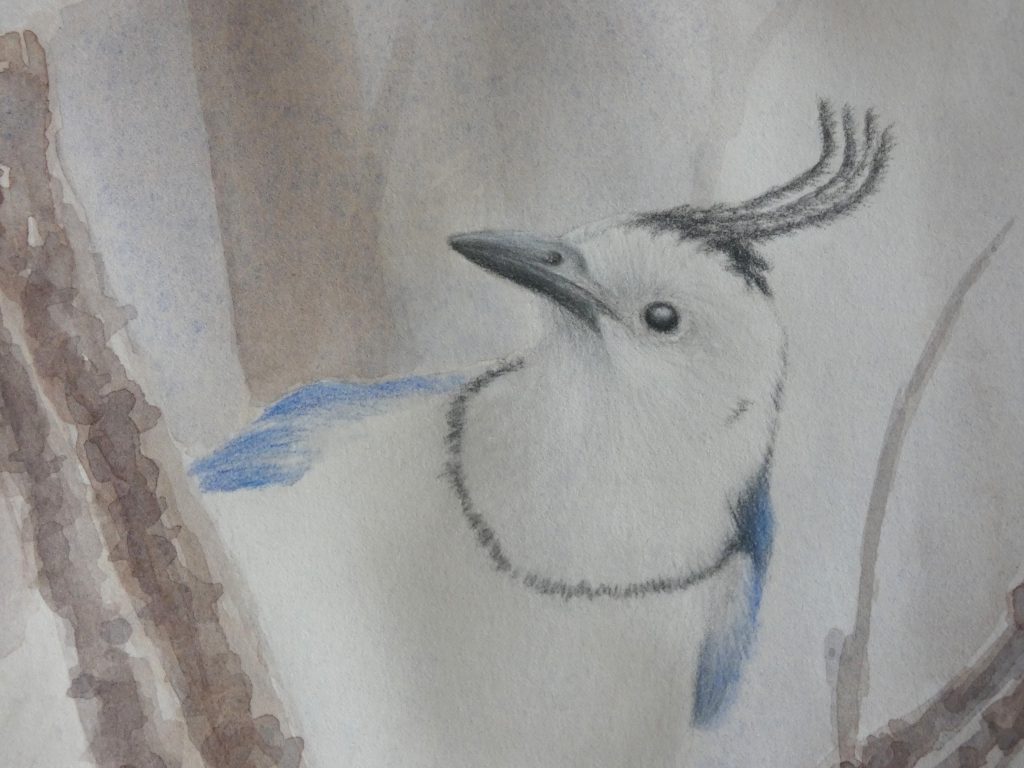
We will continue with the head. It is very important that we draw with strokes that match the direction of the feathers on the head. Look carefully at the reference photo so see how the feathers curve around the eye and the shape of the head. Even though we usually work from lightest to darkest, I find that it is easier, in this section, to start with a sharp-pointed medium grey and draw some of the feathers with it before adding the white and light grey layers.
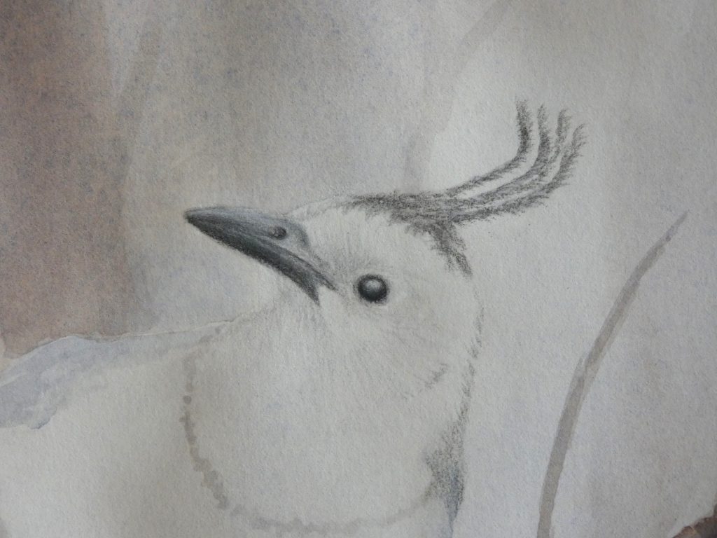
Then, go back and forth between medium greys for drawing feathers and using light greys and white to burnish. While we added the general shadows with watercolor, we can improve them by burnishing with cool greys in the shadow regions, while using white in the highlights.
Make sure to use sharp pencils for making the feathers, including the long ones that rise above the head. To give the impression of white feathers that stick out over the colored, right side of the head, we can use “negative drawing,” drawing with dark colored pencils, but leaving gaps between strokes that represent the white feathers.
The Wings and Finishing the Drawing
Since I do not have any color that quite matches the wing color, I simply used various blues and burnished with greys to approximate it. The method here is the same as before, only with different colors: draw feather-direction strokes with blues, then burnish with white or grey (choosing a darkness of grey based on the amount of shadow of the region). I left the color of the wings on my drawing a little brighter blue than what is in the picture, to help the bird stand out, and you can do the same if you’d like.
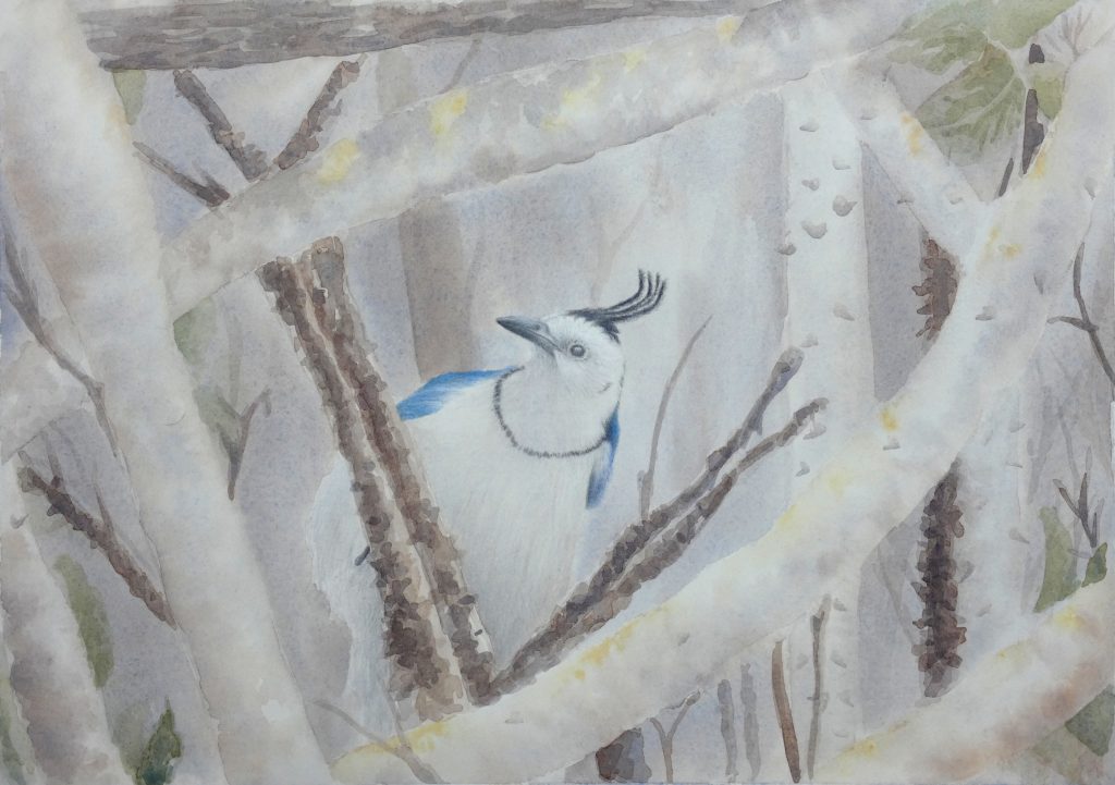
The rest of the Magpie-Jay is mostly complete from the watercolor layer, but we still need to add feather strokes with colored pencil (using the same method as we have been using).
I left most of this with less detail than I might in a completely colored pencil drawing, since I liked the watercolor look, but you can certainly add more detail if you would prefer. Feel free to develop the background branch textures more with colored pencils as well. Watercolor and colored pencils combine well, and there is a spectrum between the two that you can use in your artwork; for mine, I chose to leave much of with the unique watercolor look, while using colored pencils only to strengthen the focus on the Magpie-Jay’s head.


1 comment