Watercolor and colored pencils act well as standalone media,
but also when combined. Watercolor easily covers large areas and gives the
painter a fun looseness and freedom, but can be more difficult for creating
details. Colored pencils, on the other hand, excel at details, but are tedious
for large artworks. In this tutorial, I’ll show you how to combine watercolors
and colored pencils to create a mixed media piece that inherits the best from
both.
Several ways of combining these media are: painting in
watercolor and adding finishing details in colored pencils, drawing with
colored pencils and adding vibrance or large background areas with watercolor,
or a back-and-forth approach. For this project, we will use the first method,
using the watercolor initially, to create the background and base colors, then
working the details of the Magpie-jay with colored pencils.
Supplies Specifically for this Project
- A large piece of hot-press watercolor paper (such as Arches hot-press 14 by 11 inch)
- Watercolor paints. I suggest a warm version of each of the primaries, for the dull greens, greys, and browns that make up most of the background. For example, I will be using Quinacridone Gold, Pyrrol Scarlet, and French Ultramarine from Daniel Smith.
- Specifically, you may want a large flat brush, a large pointed round, a small flat brush, and thin-tipped brush.
- Colored Pencils. I use Polychromos, but any should work on top of watercolor.
Drawing
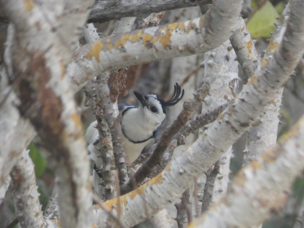
For the drawing, I suggest starting with the large branches that frame the Magpie-Jay, then drawing the outline of the Magpie-Jay, and finally adding a few of the other primary branches in the scene. Don’t feel like you need to draw everything; it is nice to have some freedom in the watercolor stage to paint branches wherever.
I’ve increased the contrast of the picture of my drawing so you can see what I included, but you will want to keep your lines lighter than they appear in the picture.
(Note that it my drawing, I mistakenly made the collar much smaller than how it is in the reference. I did not realize this until I was almost finished with the colored pencil work, and it was too late to fix it.)

Preparing to Paint
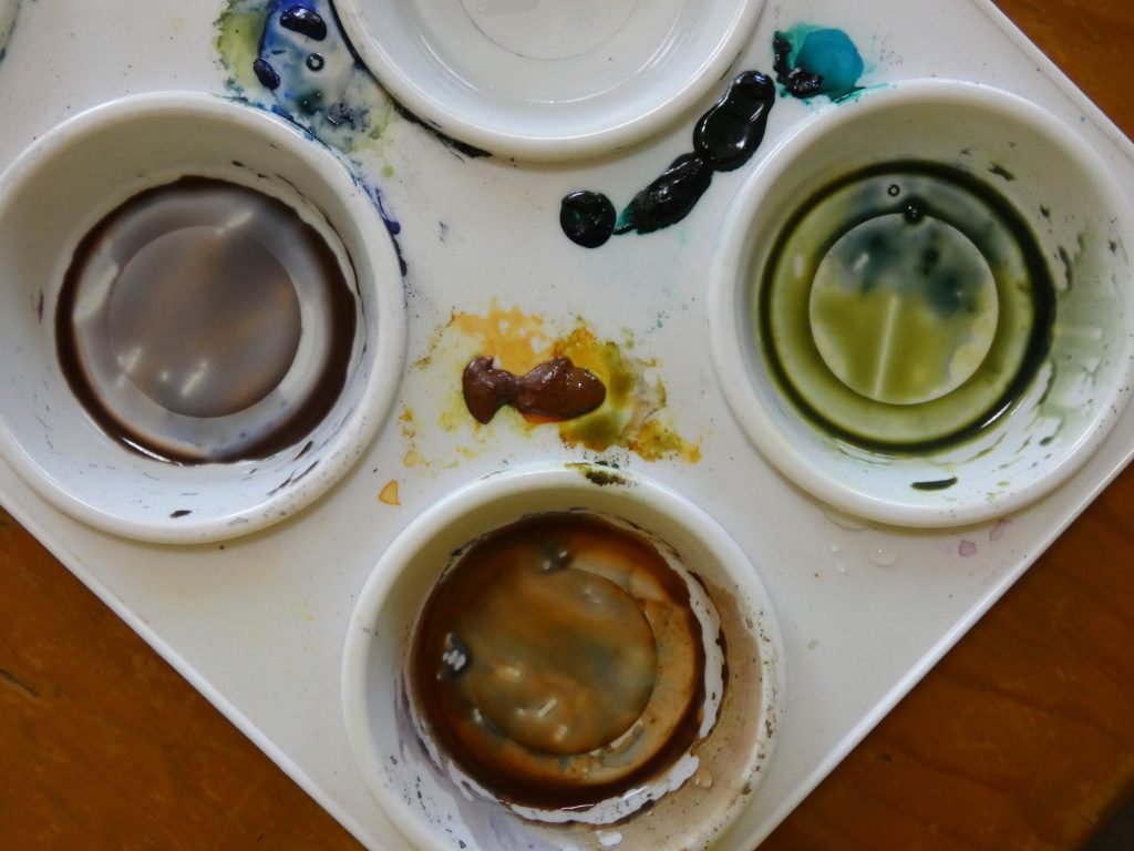
To reduce buckling, soak the paper and tape it to a firm surface. While we wait for it to dry a little, let’s choose and mix colors. As mentioned in the supplies list, you will need a warm yellow, blue, and red for this project. If you are unsure of which paints to use, try out several mixtures to see what kinds of browns, greys, and greens different paints make together. I found that Quinacridone Gold, Pyrrol Scarlet, and French Ultramarine combine to make perfect shades of natural greys, browns, and greens, so I chose to stick with these three paints for the entire watercolor painting part.
Beginning the Painting
Since the main branches are white-barked, and lighter in value than the general background color, we will start with negative painting to make them pop out. Negative painting is a method in which you paint around the outside of something rather than painting inside the lines. In this case, it means using a grey background color and painting everything except for where the bird or branches are.
Before you do this, make sure the paper is moderately wet, painting it with clean water if it is too dry. Then, when you paint the background, the paint will naturally soften and spread at the edges of the branches, which is what we want for an initial layer, so that there is not too much contrast yet.
By painting first along the edges of the branches that are out of focus in the reference image, we can create the soft edge effect while the paper is more wet, then move on to the in-focus branch edges when the paper is closer to dry for sharper edges.
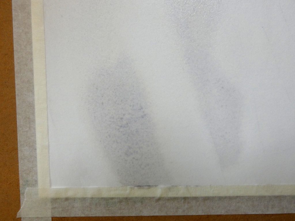
Here is what this looks like in the bottom left corner.
Continue around the painting, and the branches will begin to form.
If you are using French Ultramarine in your mixture, as I am, you will notice that it sinks and granulates more than the other pigments, which creates a nice effect of a light brownish color spreading onto the branches.
Use a clean brush or paper towel to remove color, if it spreads into the bird, or too far on the branches. You can also pull some of the paint off to hint at distant, white branches when the paint is halfway dry.

After the first layer completely dries (this is important, otherwise the paint will come off), wet the entire paper again and repeat with a second layer, to darken the background further.
Background Objects
We’ll use a series of translucent layers to develop the leaves and sticks in the background. I’ll review the procedure here, but for more details, check out this tutorial.
Using a watery mixture of green paint, add leaves around some of the branches, similar to how you see them in the reference image. Vary the color slightly by adding a drop more of blue to the paint for several leaves, or more yellow for others.
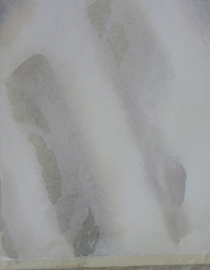
This first layer will dry and be very faint, as though in fog.
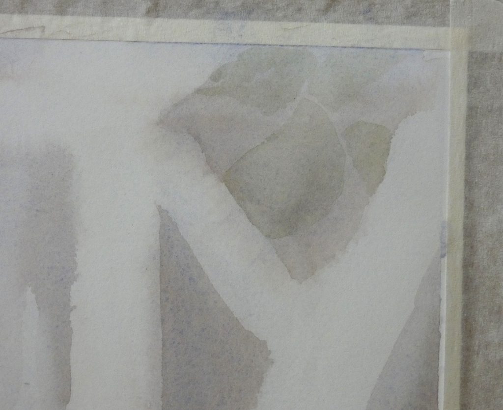
Keep layering to build depth and make certain objects appear closer. The overlapping layers create an effect unique to watercolor. This is one of the reasons to use this media for backgrounds.
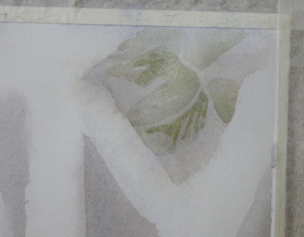
Use the same method to paint sticks and small branches.
To create the illusion of depth between branches, we can use the following plan: one translucent layer for the branches and sticks that are farthest away from the viewer, more and more layers for closer objects, but soft/blurry layers for the closest branches (that are out of focus in the picture). This means that the most distinct layers will be for branches in the same focal plane as the Magpie-Jay, especially the branches it is sitting on. For now, concentrate on the background branches, and I’ll explain the details for the primary branches below.

Repeated layering can develop the ridged textures of the branches. (This picture shows the result of 2-3 layers, and we’ll keep adding more, but while waiting for the layers to dry, we can move on and paint the primary branches).
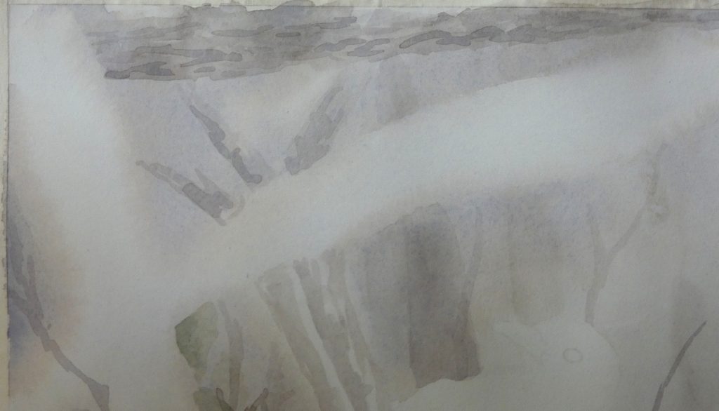
Primary Branches
For the large, out of focus branches in the foreground, we can paint the branch with clean water to make it damp before adding color, so that when we paint it with color, it will be easy to form soft edges and color transitions.
While painting these branches, keep in mind the shape of them, painting the shadow with brush strokes in the direction of the cross contours. Use a separate, clean brush to spread the color and to pull it off of the areas that you want to leave mostly white.
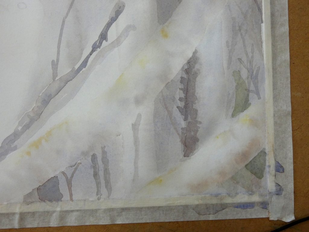
After you have painted a layer on each of the “white” branches, you might need to darken the background to make the branches continue to stand out. I did this by simply painting the background regions with clean water to control the spread of the color, then painting a thin layer of grey over them. If you do this, you may want to also add another layer to some of the background objects.
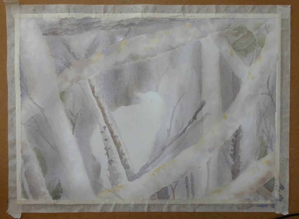
We will paint the smaller branches that are in sharp focus with a series of distinct layers. This is similar to how we did the background branches, only with 5-10 layers rather than just 1-2. I find it helpful to use a large brush for this, which forces me to make looser strokes. Keep the spiky bark texture in mind while you paint these, and convey that texture with many overlapping layers. (I forgot to photograph this stage, but you can see the result by scrolling down to the picture after the next).
A possible approach for adding spines to the large white branches is to paint a short line, then use a small, clean brush to soften the edge upward, forming a cone-like shape.

Painting the Magpie-Jay
Since it will be easiest to do most of the Magpie-Jay with colored pencils, we will just add an initial wash with watercolor to set some of the values and unify it with the rest of the painting.
First, I painted some of the darker shapes with a thin layer, since I did not know if I would be able to see my pencil lines after painting the wash. You can do this too, if you’d like, but it is not necessary if your lines are clear.
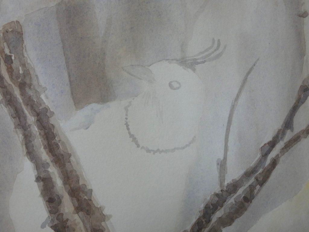
For the wash, paint the entire bird with clean water, then lightly paint with grey in the shadow regions. Use a second brush if necessary, to spread the paint. This forms the overall shading and will allow us to focus on feather detail with colored pencils.
Using a light layer of blue, paint the top of the wings and the beak. We’ll add much more to these sections with colored pencils, but this watercolor layer will help unify the drawing section with the painted background.
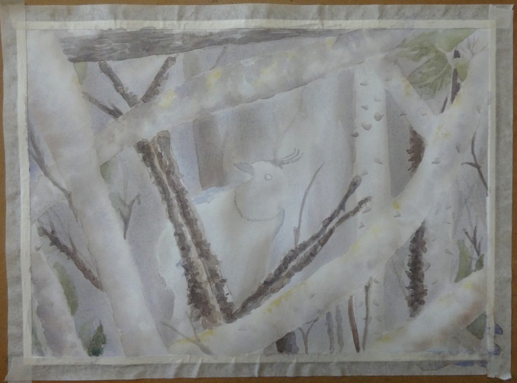
With that, we are done with the watercolor. In Part 2 of this tutorial, we will use colored pencils to finish the artwork.


I was very happy to find this great site. I want to to thank you for your time due to this fantastic read!! I definitely savored every little bit of it and I have you saved to fav to see new stuff in your web site.